Modelling Radar and Wireless interference in the 5GHz range
Background
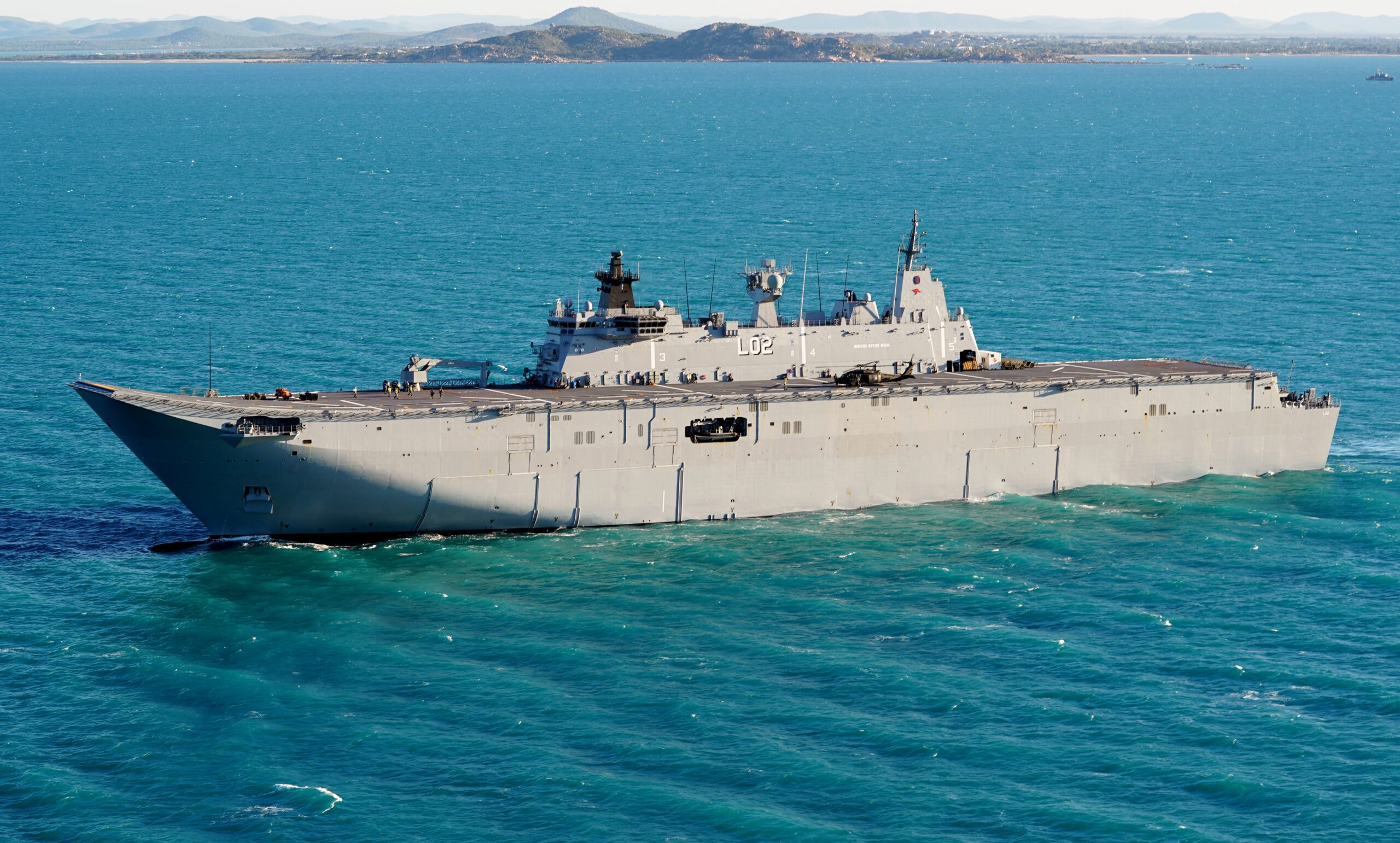
In the early morning of the 4th of July 2025, the Australian warship HMAS Canberra sailed down the west coast of the North Island of New Zealand. It had its navigation radar on, surveying the sea for obstacles. At the same time, residents along the coast found their wireless residential and business internet failing. The story soon hit the local news sites which spread across the globe.
For most people, having their Wi-Fi supposedly jammed by a warship isn’t a regular occurrence so it’s not a surprise the story went viral. However, a lot of the explanations were incomplete and didn’t explain the science behind the issue.
Using the tools offered by CloudRF, we can recreate the events and learn how radar and wireless comms interact.
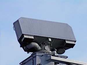
The Radar System: SAAB Sea Giraffe AMB
First, a clarification. Maritime navigation radar is not a monolithic category. Commercially, the most common bands are X-band (~9.5 GHz) and S-band (~3 GHz), both of which are regulated for civilian maritime use and appear on everything from fishing trawlers to container ships. Military vessels frequently also carry C-band systems (~5.5 GHz), which offer a useful engineering trade-off: better range and resolution against small surface targets than S-band, but with less atmospheric attenuation than X-band.
On board the HMAS Canberra, there is only one named C band radar, the SAAB Sea Giraffe AMB. From the brochure “The SEA GIRAFFE AMB is a medium range, multi-role surveillance radar optimized for detecting small air and surface targets with high update rate in all kinds of environments, including the littorals” which is ideal for transiting the rugged coastlines of New Zealand.
Naturally, full information on this system is not publicly available, so we shall have to try and source as much as possible and then estimate the remaining parameters. This will be saved as template in CloudRF and used for multiple calculations:
{
"site": "SeaGiraffe",
"network": "HMASCanberra",
"engine": 1,
"coordinates": 1,
"transmitter": {
"lat": -39.478009,
"lon": 173.687817,
"alt": 43,
"frq": 5550,
"txw": 25000,
"bwi": 100,
"powerUnit": "W"
},
"receiver": {
"lat": 0,
"lon": 0,
"alt": 8,
"rxg": 0,
"rxs": -64
},
"feeder": {
"flt": 1,
"fll": 0,
"fcc": 0
},
"antenna": {
"mode": "template",
"txg": 30,
"txl": 0,
"ant": 1,
"azi": 0,
"tlt": 0,
"pol": "v"
},
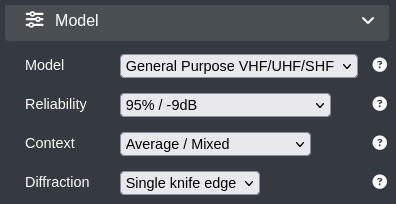
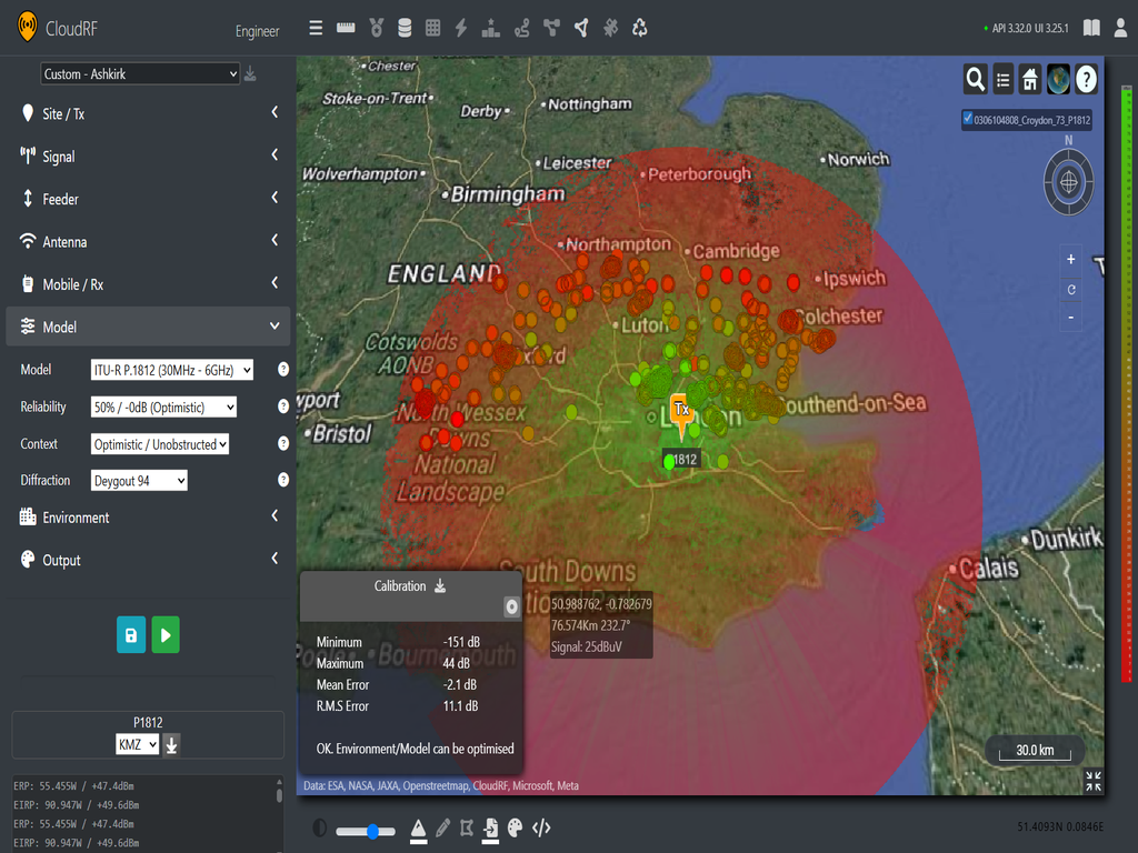
"model": {
"pm": 4,
"pe": 3,
"ked": 2,
"rel": 50
},
"environment": {
"elevation": 2,
"landcover": 1,
"buildings": 1,
"obstacles": 0,
"clt": "Temperate.clt"
},
"output": {
"units": "m",
"col": "GREEN.dBm",
"out": 2,
"nf": -94,
"res": 60,
"rad": 120
}
First, we can estimate the transmission power to be around 25kW which in this case is going to be our peak power.
We will set our bandwidth to be 40MHz which gives us single digit meter range resolution, though this maybe too high for more general surveillance, these types of radars can adjust their bandwidth to help search for specific features.
We shall set our center frequency to be 5550MHz which places us comfortably within the C band range.
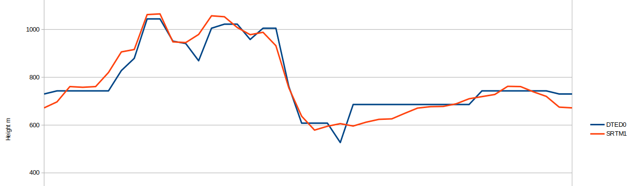
Our last two variables relate to our antenna. Radar antennas are naturally placed on a ships mast, and the HMAS Canberra has several. The exact height isn’t available, but we know the tallest point on the Canberra is “45cm below the Sydney Harbour Bridge” which is roughly 49m above sea level. Looking at the vessel, there are two towers which are shorter than the aft tower. We can see from photos of the Canberra that the sea giraffe is in the middle tower. By subtracting a few metres gives a transmit height of roughly 43m.
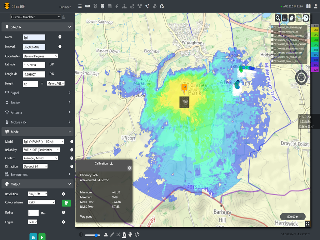
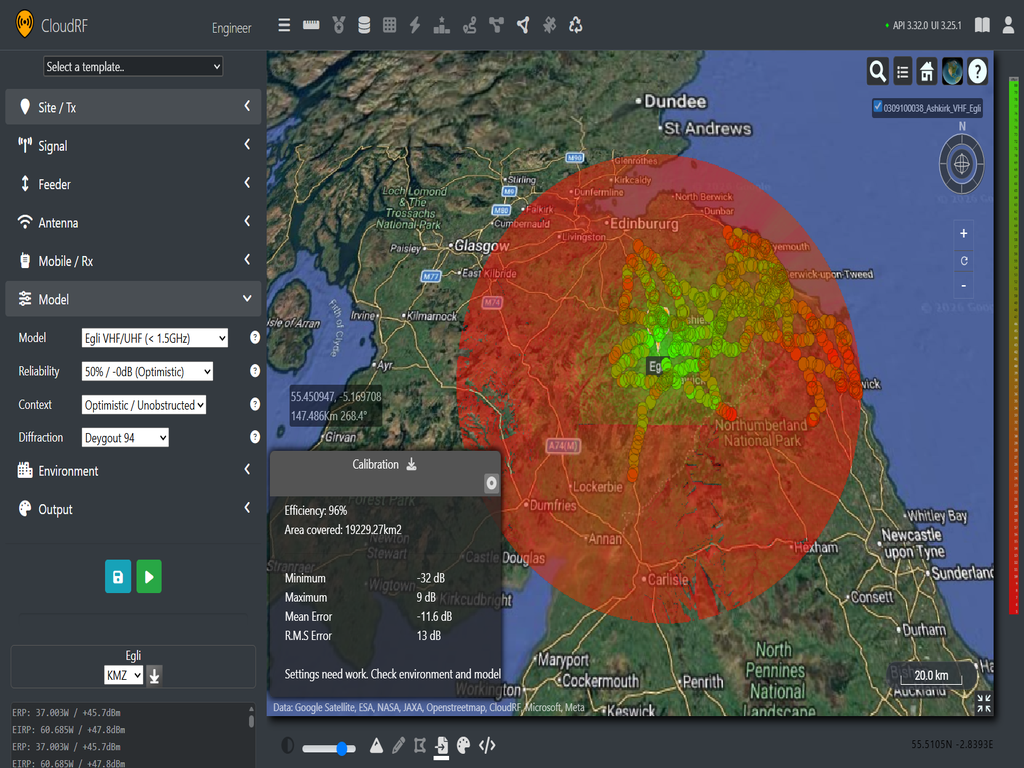
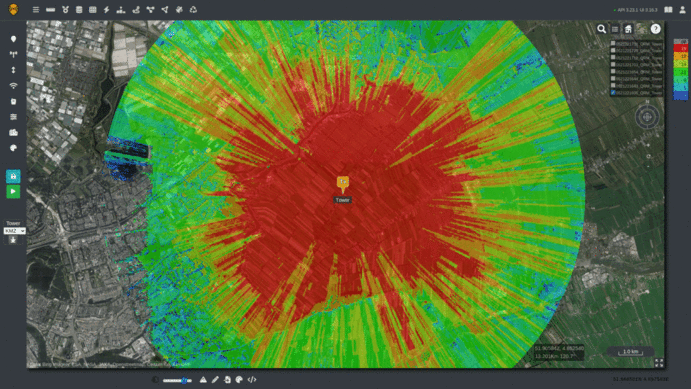
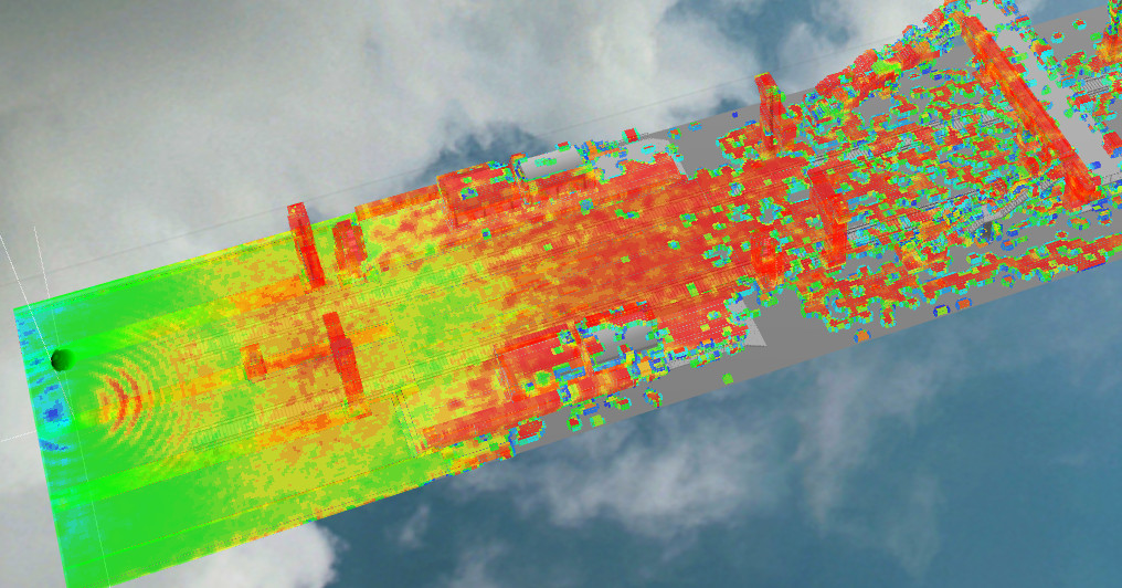
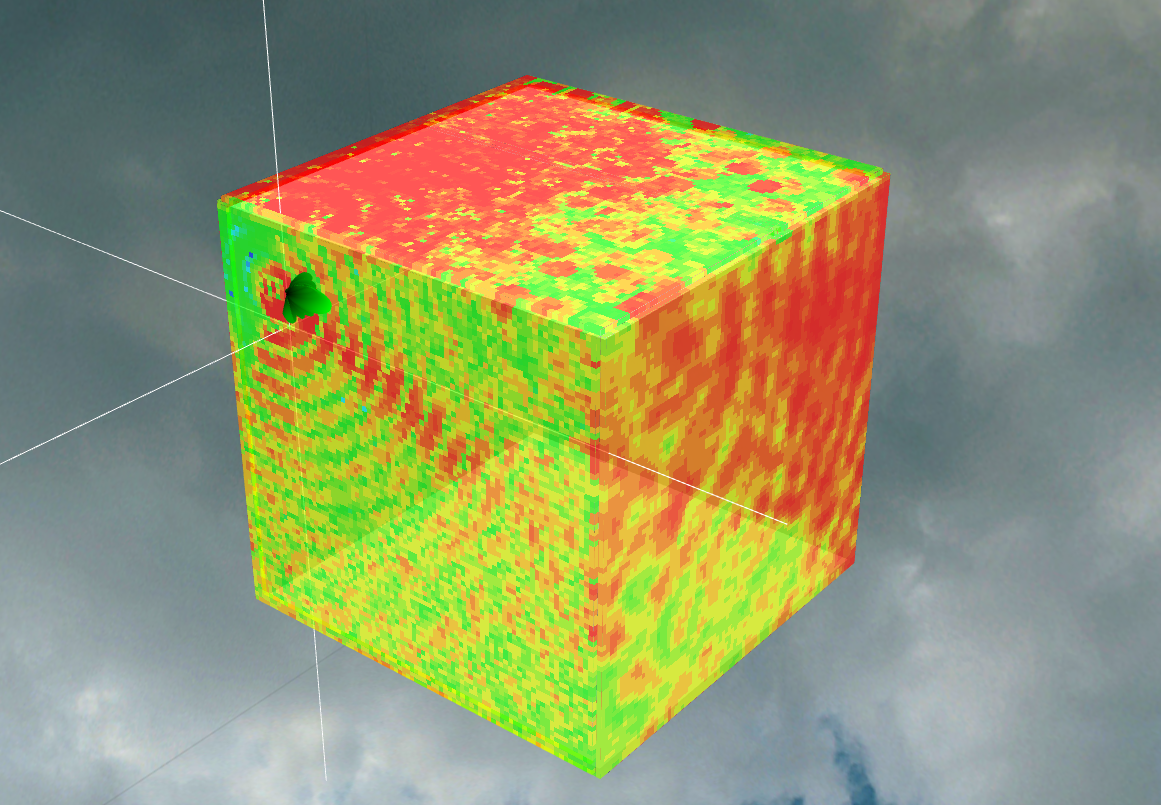
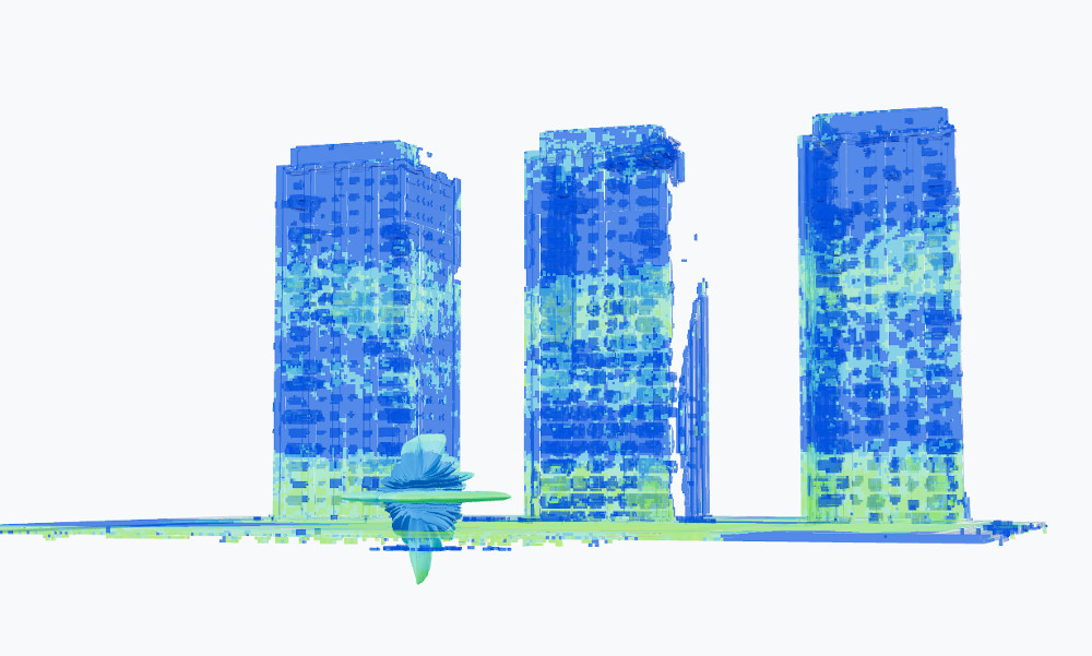
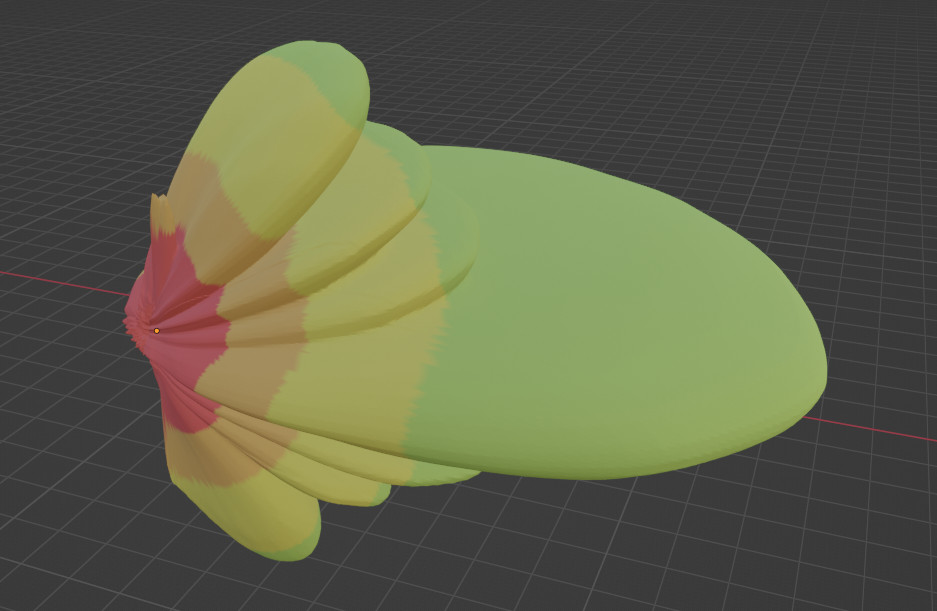
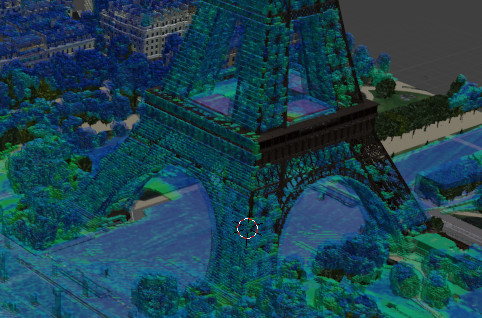
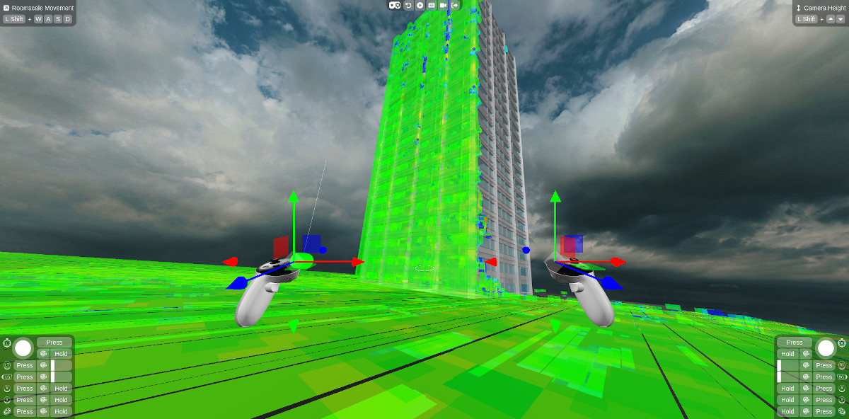
For the antenna itself, we will use it’s rotation our advantage and model the system as a dipole, giving uniform coverage in all directions. With the template set up, we can make a prediction of the signal strength around the ship and see the radar’s potential coverage which by design is significant.
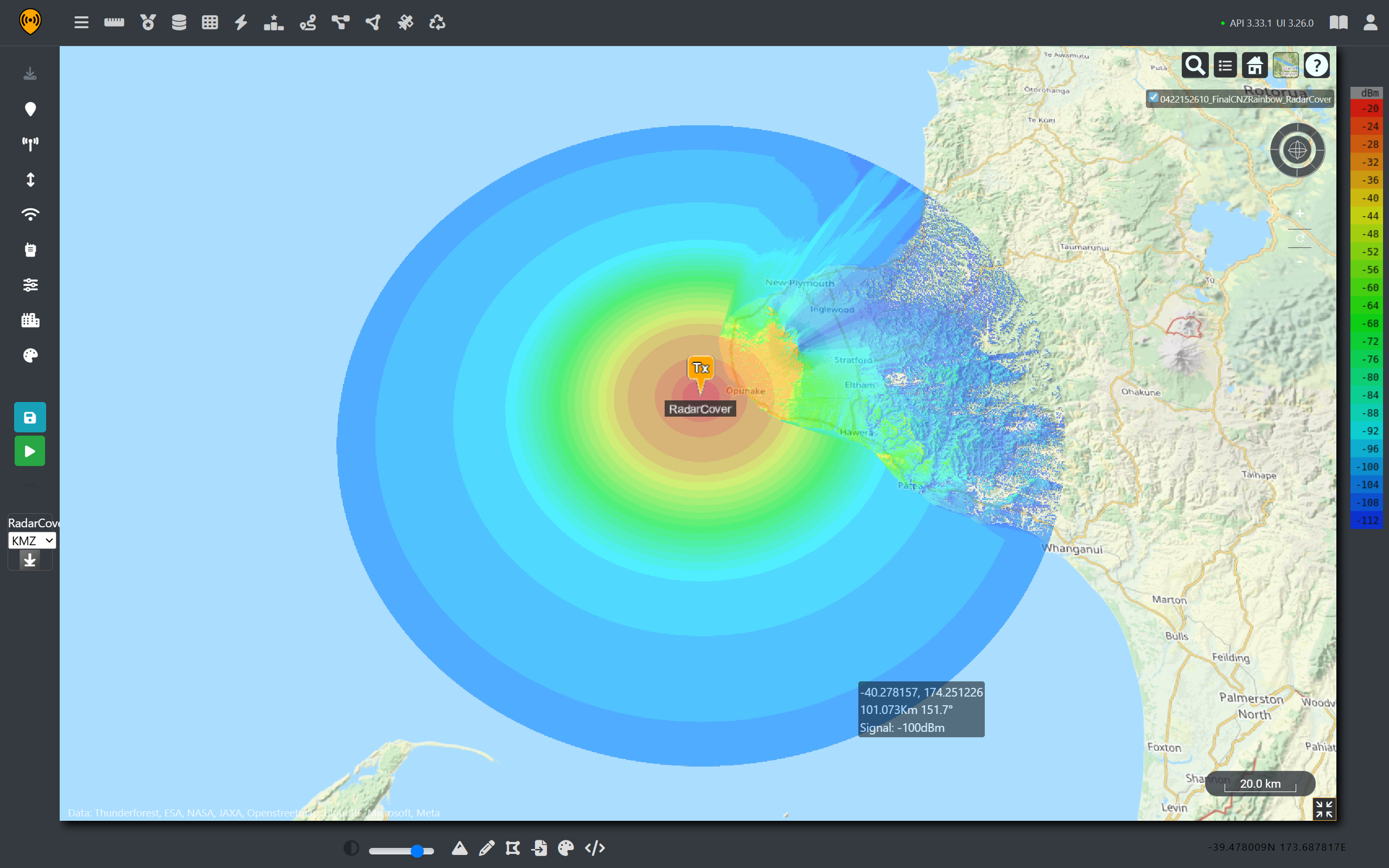
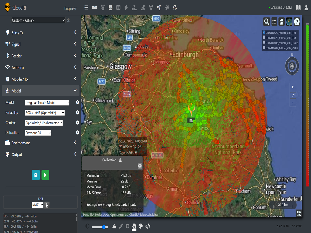
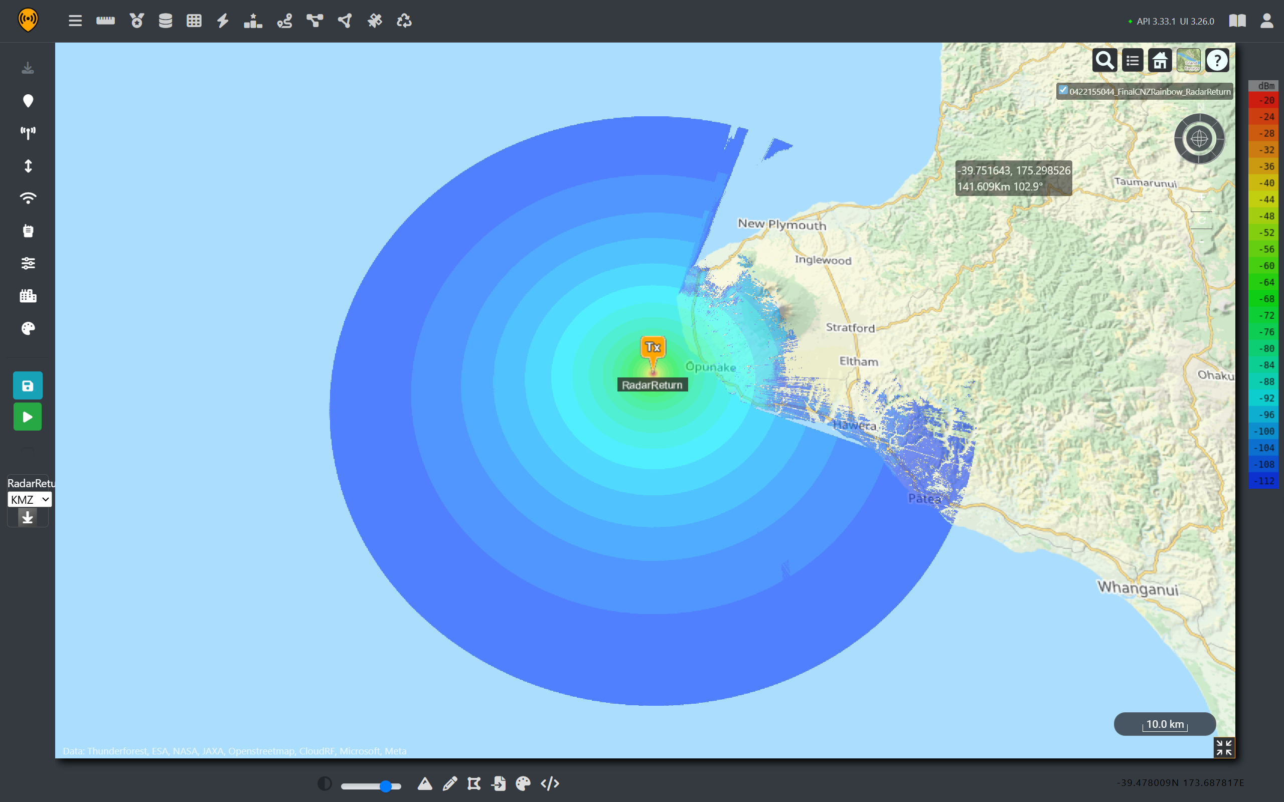
As we can see from the scale of the image, the HMAS Canberra’s radar signal propagates more than 150Km from the origin. However, as the signal must return to be sensed, we can use the radar model to give a rough indication of received power for a given radar cross section. In the image below an RCS of 10m2 at a height of 10m was used, giving much lower return values demonstrating why radar signals need so much more transmit power compared to regular communications.
5G Fixed Wireless Access
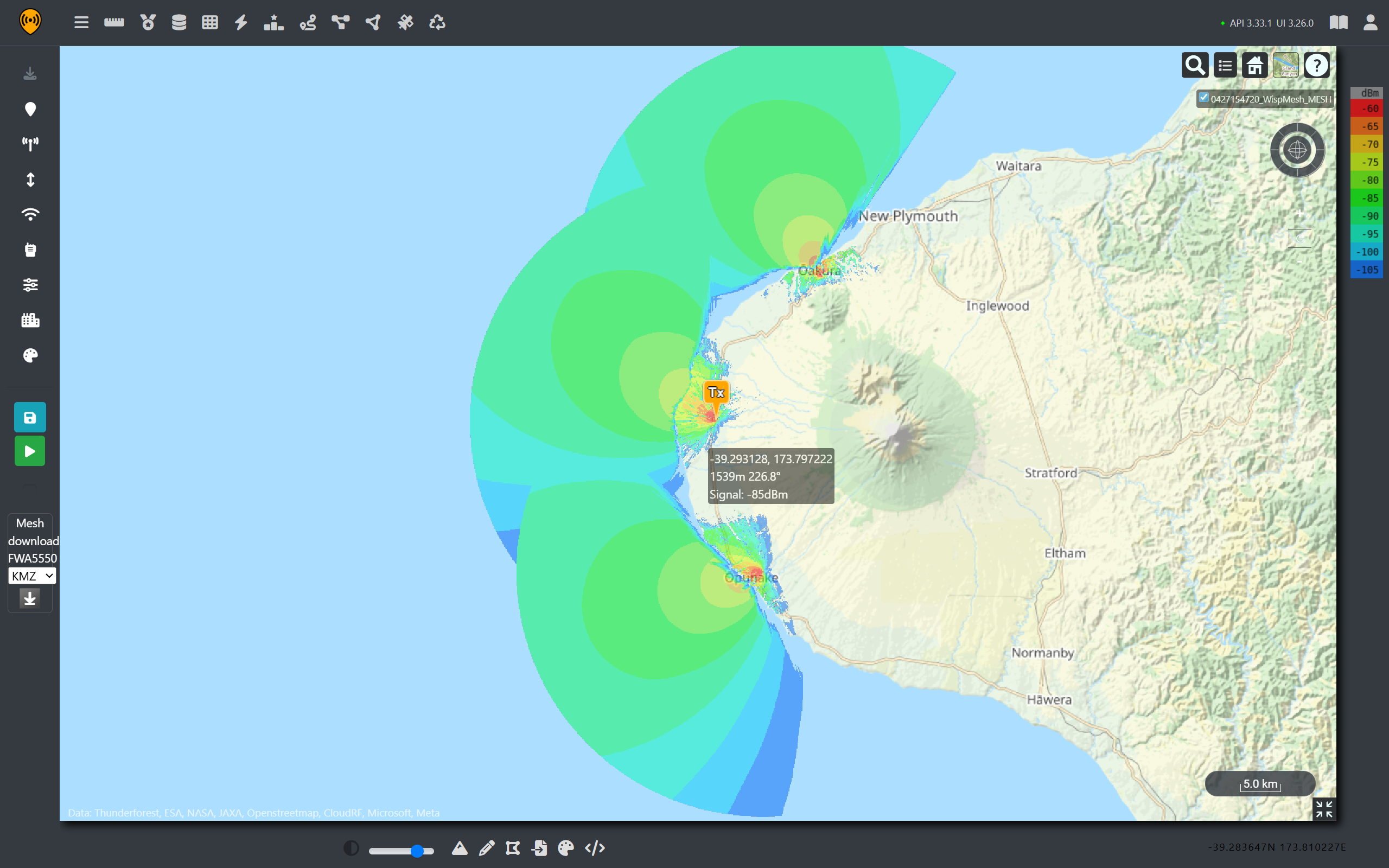
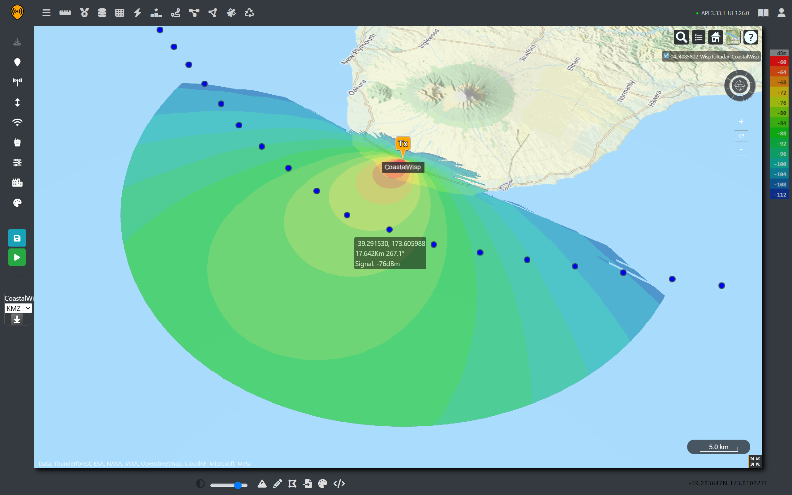
On the other side of this situation, there are several privately owned and operated Fixed Wireless Access (FWA) networks providing rural communities internet access. In New Zealand, many WISPs utilise unlicensed RF spectrum under GURL licences. For a rural area at least, there are enough open channels and limited ranges that networks can dynamically operate around each other without causing significant interference issues.
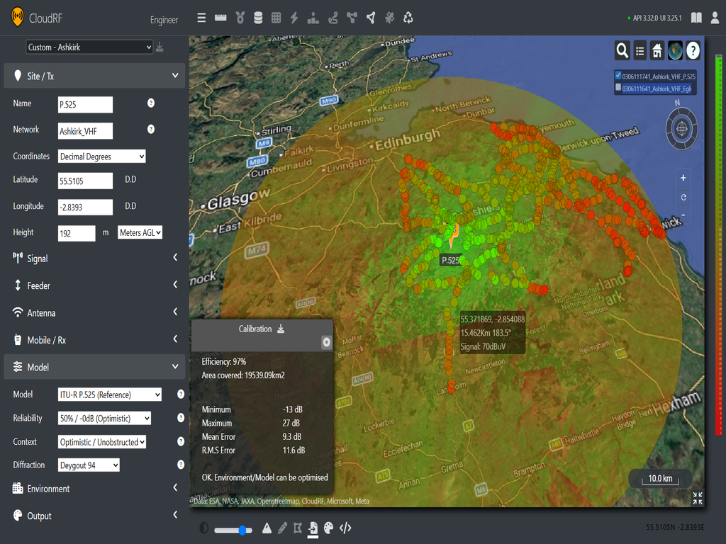
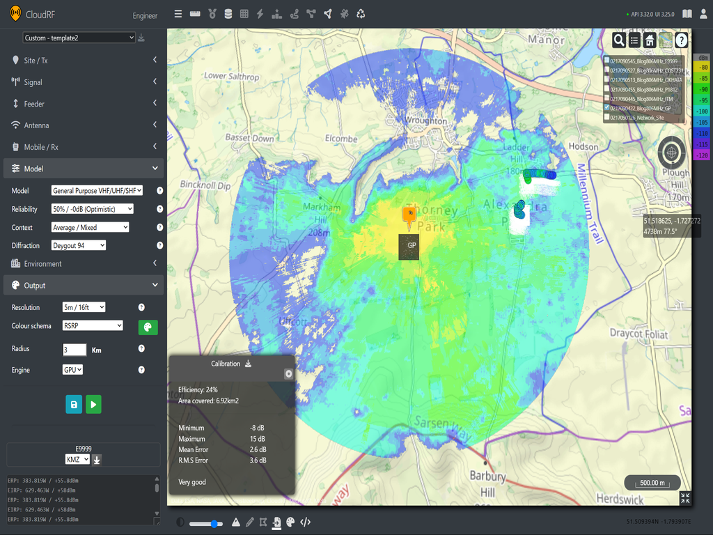
To develop an understanding how a network provides coverage, a fictional FWA tower is templated in Cloud RF and used to give wireless coverage over the small town of Opunake on the East Coast. We can use Radio Spectrum New Zealand’s licensing requirements to establish reasonable power, frequency and tilt requirements. We set our receiver at 5m to represent a rooftop in the nearby towns.
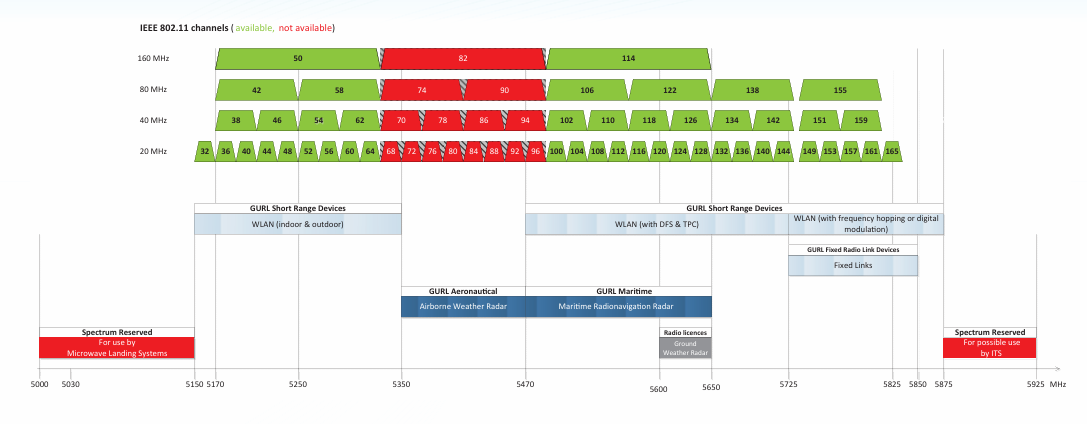
For frequencies we can implement Radio Spectrum Management New Zealand’s FWA allocation depicted below.
5G FWA template
{


    "site": "Site-A",

    "network": "NZ-WISP",

    "engine": 1,

    "coordinates": 1,

    "transmitter": {

        "lat": -39.283647,

        "lon": 173.810227,

        "alt": 22,

        "frq": 5550,

        "txw": 0.01,

        "bwi": 40,

        "powerUnit": "W"

    },

    "receiver": {

        "lat": 0,

        "lon": 0,

        "alt": 5,

        "rxg": 23,

        "rxs": -105

    },


    "antenna": {

        "mode": "template",

        "txg": 23,

        "txl": 0,

        "ant": 3587,

        "azi": 310,

        "tlt": 1,

        "pol": "v"

    },

    "model": {

        "pm": 4,

        "pe": 2,

        "ked": 2,

        "rel": 50

    },

    "environment": {

        "elevation": 2,

        "landcover": 1,

        "buildings": 1,

        "obstacles": 0,

        "clt": "Temperate.clt"

    },

    "output": {

        "units": "m",

        "col": "LTE.dBm",

        "out": 2,

        "nf": -90,

        "res": 20,

        "rad": 30

    }

}
Selecting channel 110 sets the center frequency to 5.55GHz, and a coverage map can be created for the fictional site.
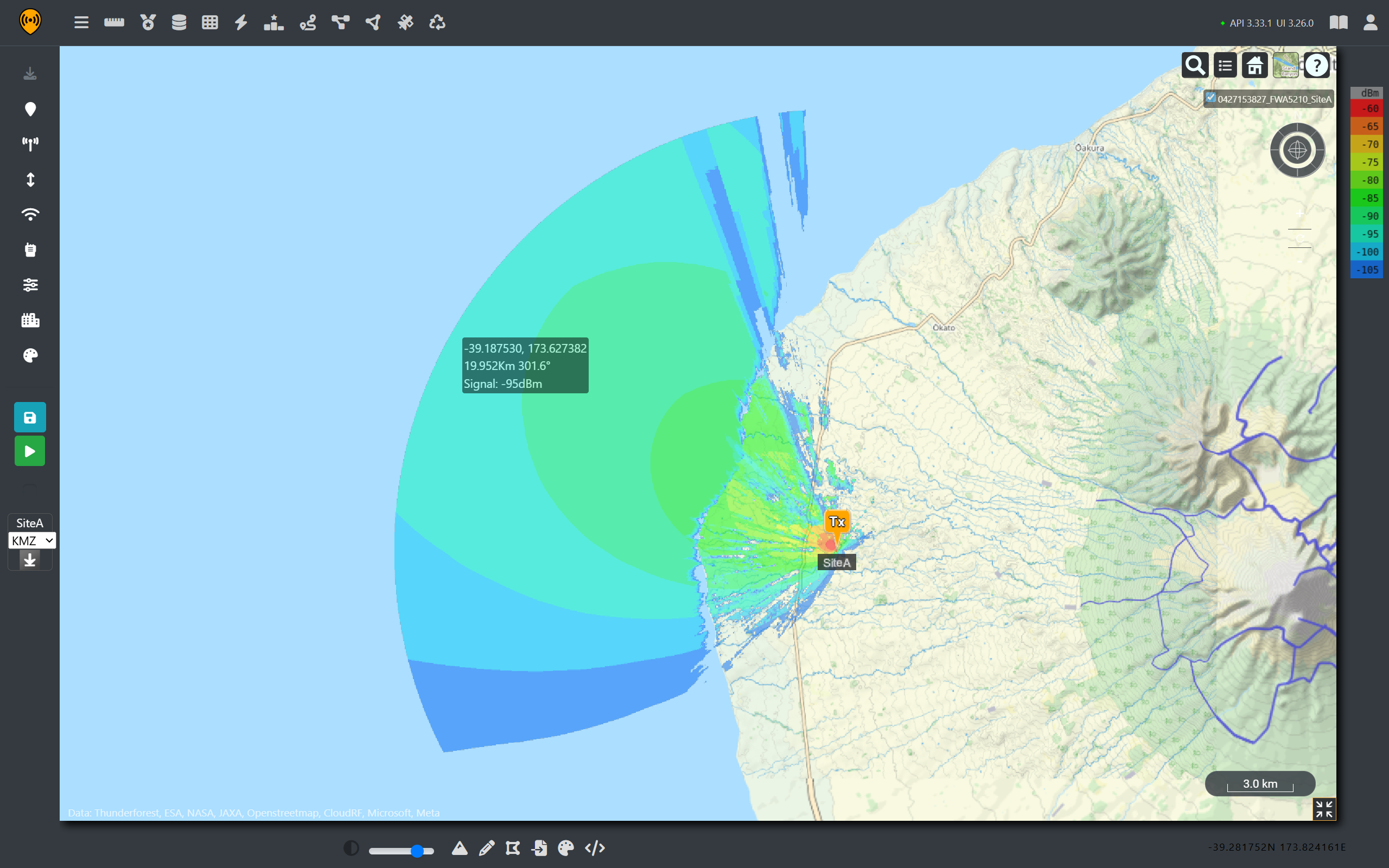
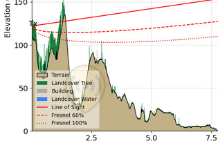
From the coverage prediction, we can see that the relatively low power WISP is still receivable from nearly 20Km away with a clear line of sight for a 40MHz link. So, for any coast facing towers, there’s a good chance their signal can be detected offshore well past the intended service range.
Dynamic Frequency Selection
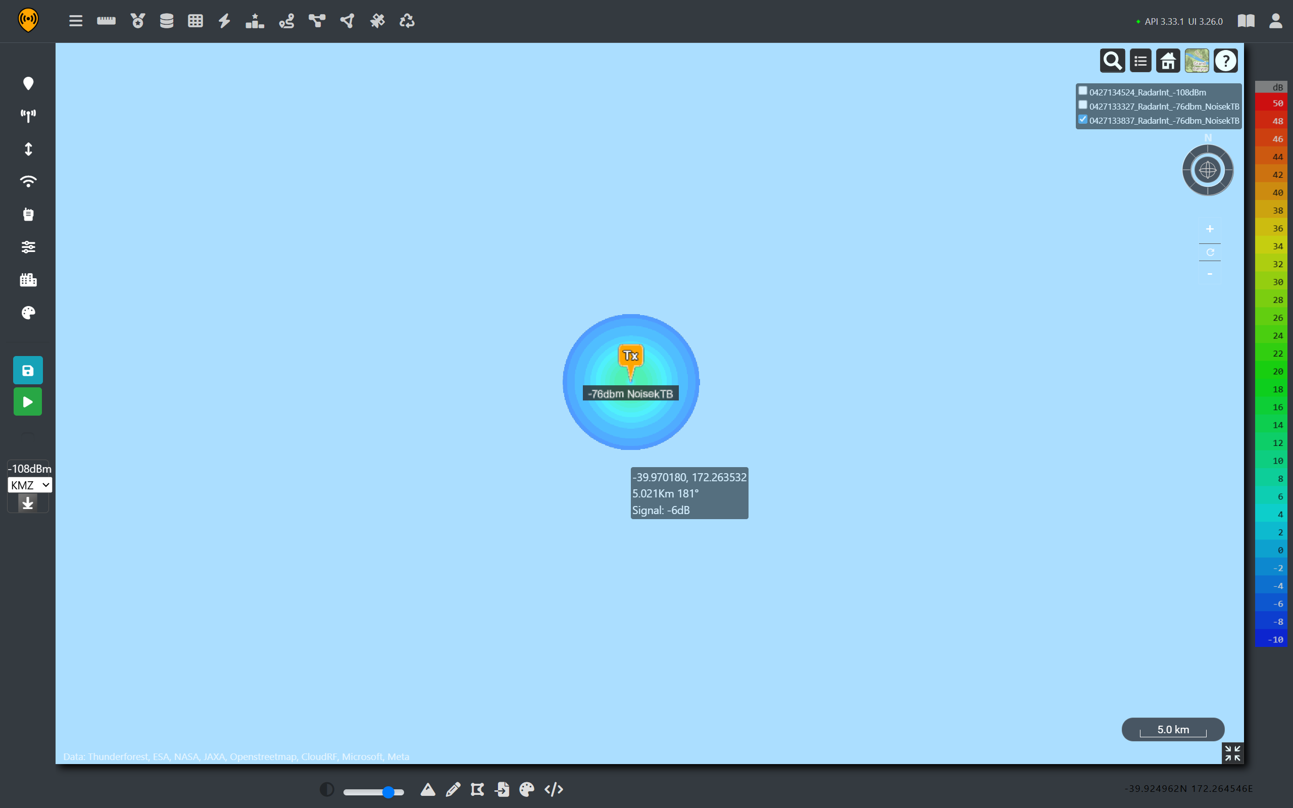
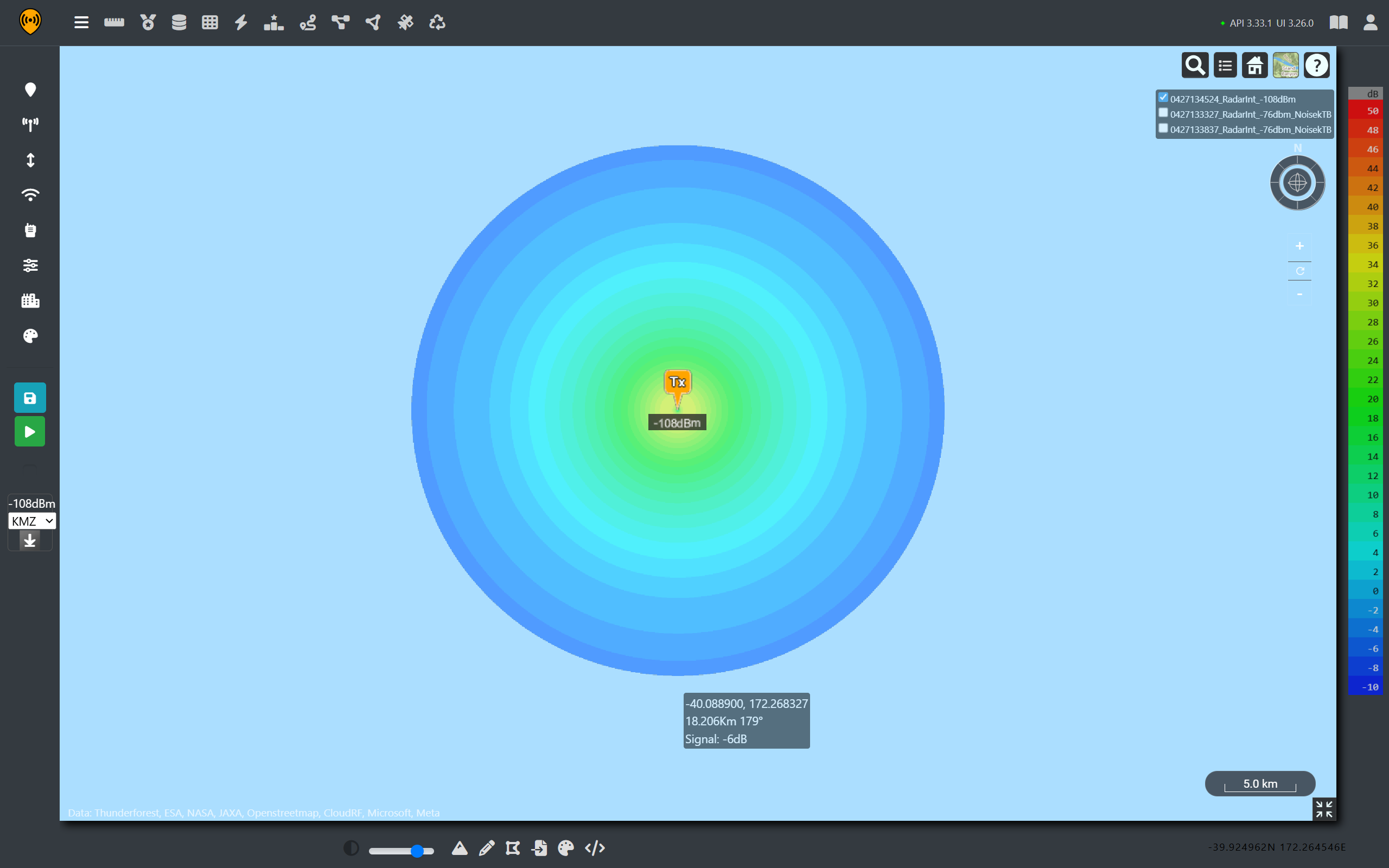
As part of the licence requirements, radios using these bands are equipped with Dynamic Frequency Selection (DFS). This is an intentional safety mechanism recommended by the ITU to prioritise and protect Maritime radio navigation systems. The goal is to prevent interference by triggering a shutdown upon detecting radar pulses. The priority is to protect the radar picture which is safety critical.
Above a threshold, a received pulse will cause the wireless device to switch to a different frequency or shutdown it’s radio. It will listen out until it can no longer detect radar pulses before returning to that frequency and transmitting again so is performing automated de-confliction.
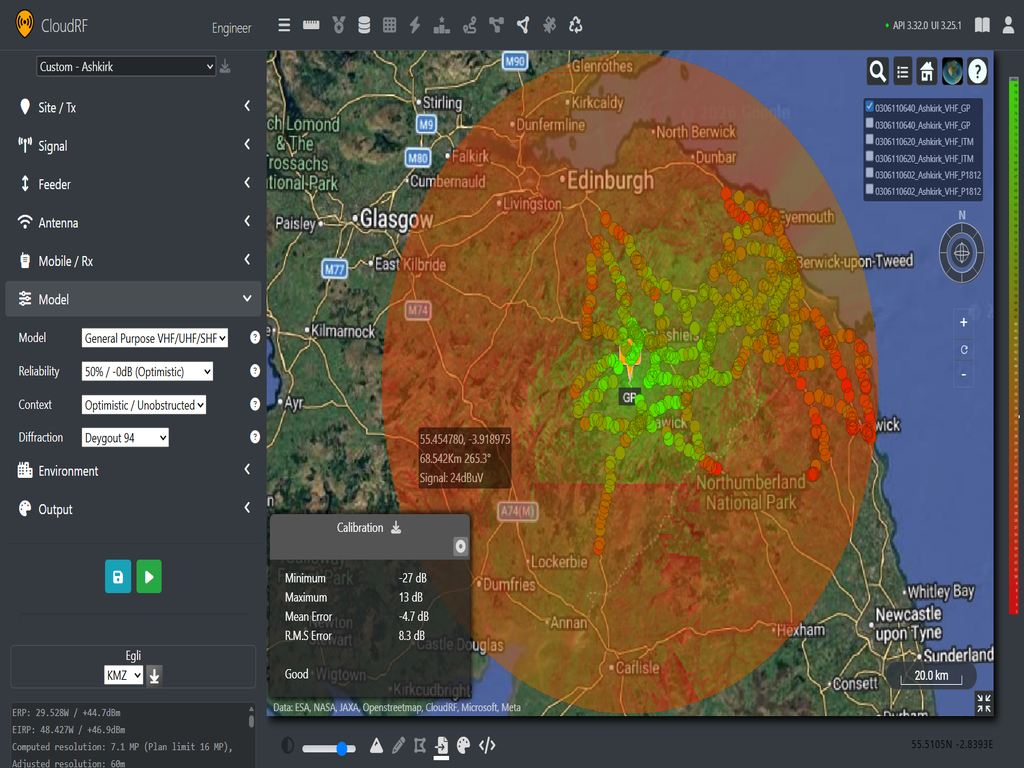
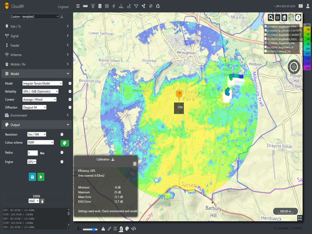
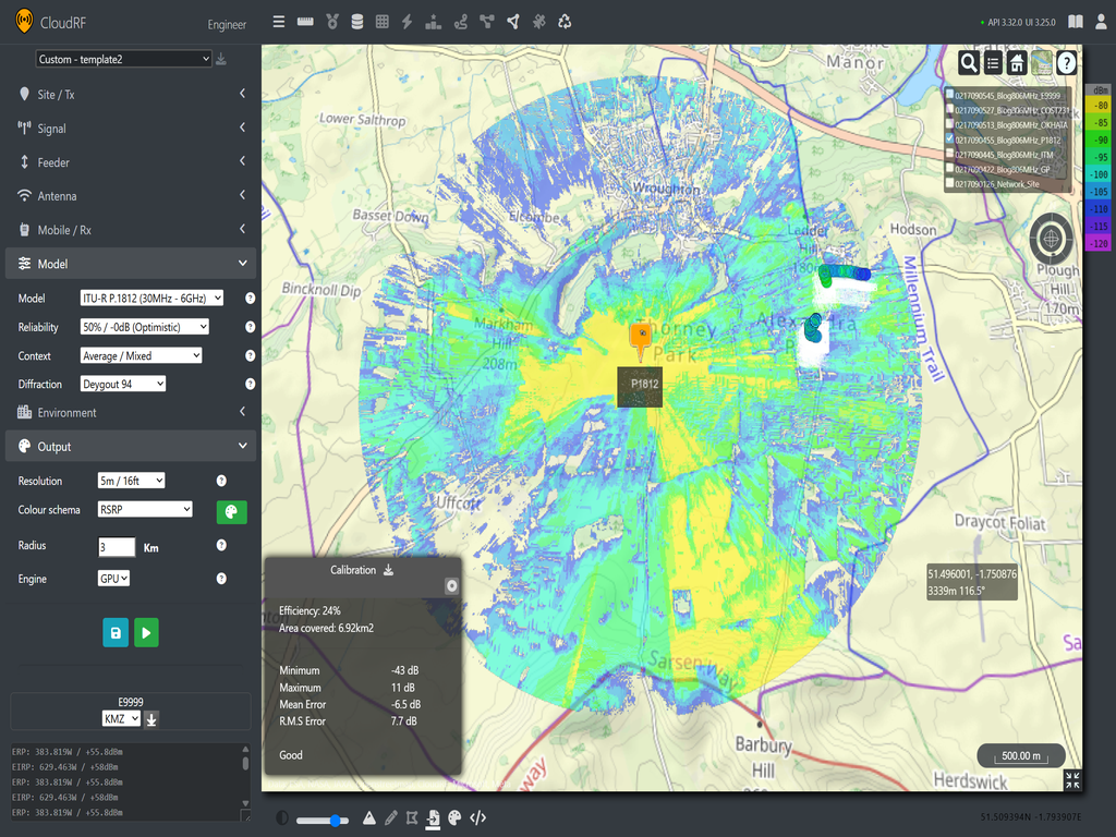
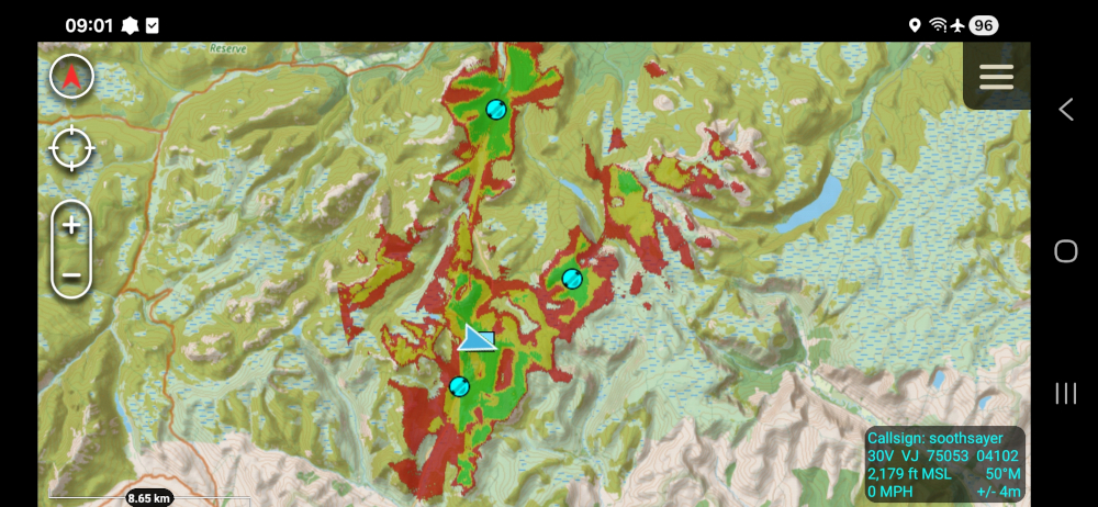
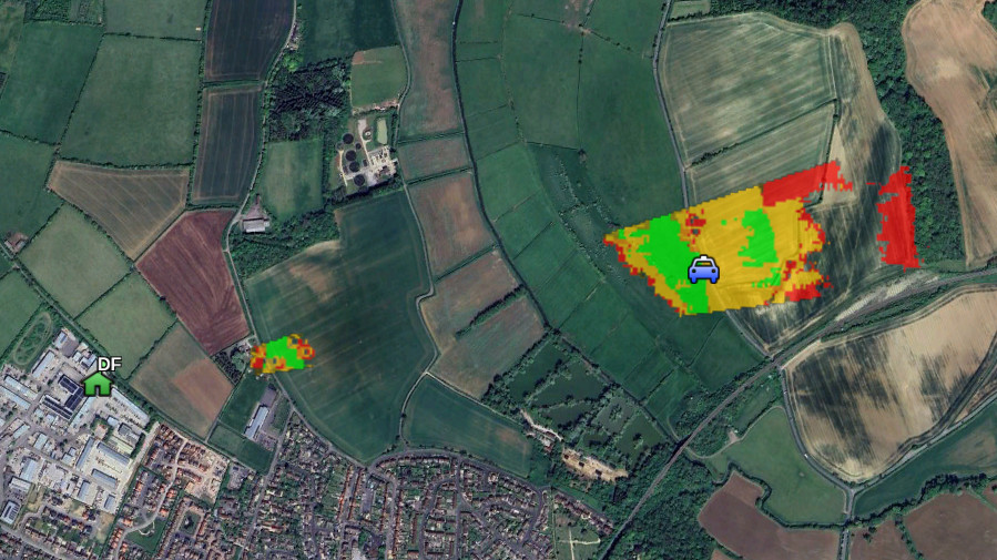
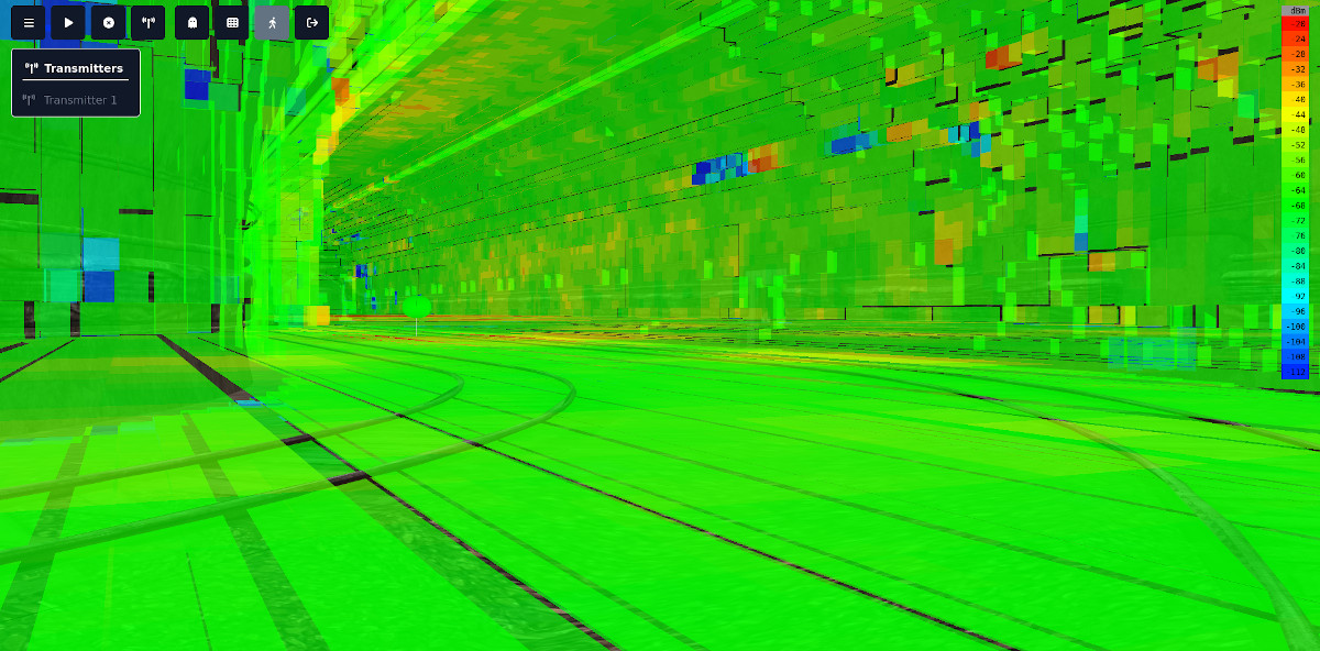
For our FWA systems, the threshold is set to -64dBm from a radar, received by a reference dipole with 0 dBi gain which is very easy to set up in Cloud RF by adjusting receiver sensitivity up to -64dBm and then remapping the coverage. In the image below, the areas in green represent a radar signal above the threshold that will trigger DFS.
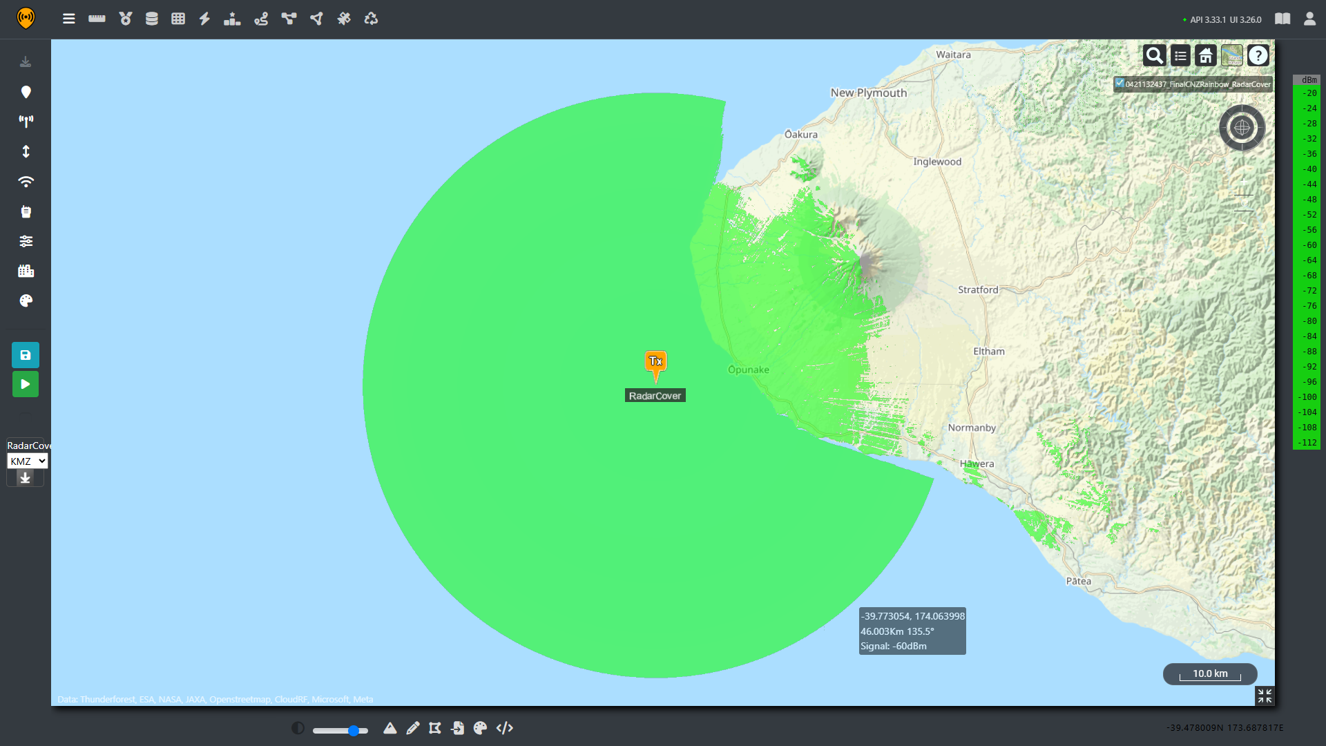
As we can see, the radar signal easily covers the coastline and extends deeper into the mountainous areas. However, this is just a fixed location and not representative of the dynamic coverage of the moving platform.
Estimating the Full Extent of the Outage.
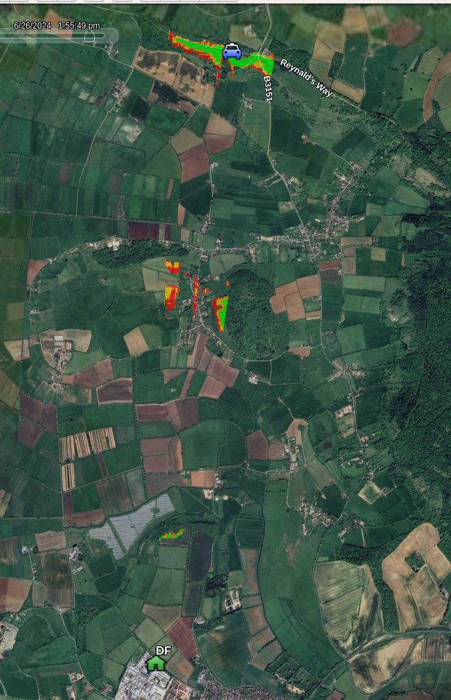
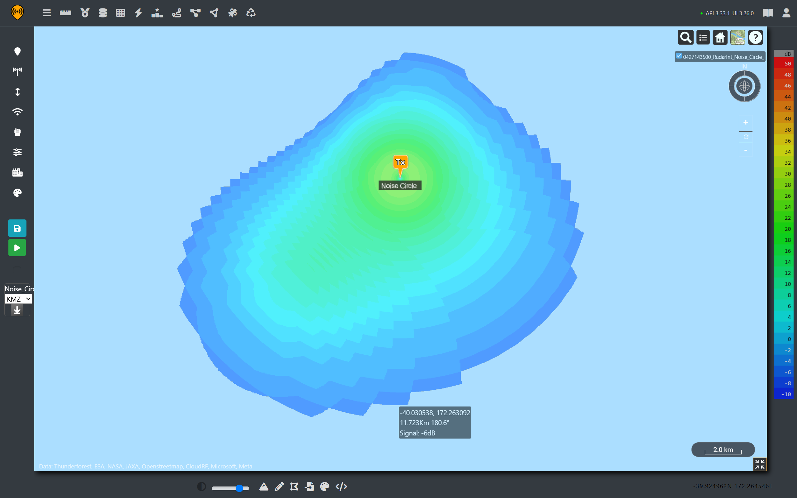
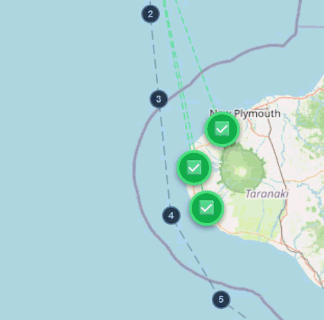
Rather than picking and analysing a single spot, we can recreate a similar course sailed by the HMAS Canberra and then use points along this track to build a comprehensive understanding of the impacted coastline.
We know that the ship sailed down the west coast of the north island before heading into the cook straight on the way to its destination in Wellington. It’s not clear when the ships radar was switched to a different frequency and it is not possible to get historic coordinates like commercial shipping so likely course has been chosen.
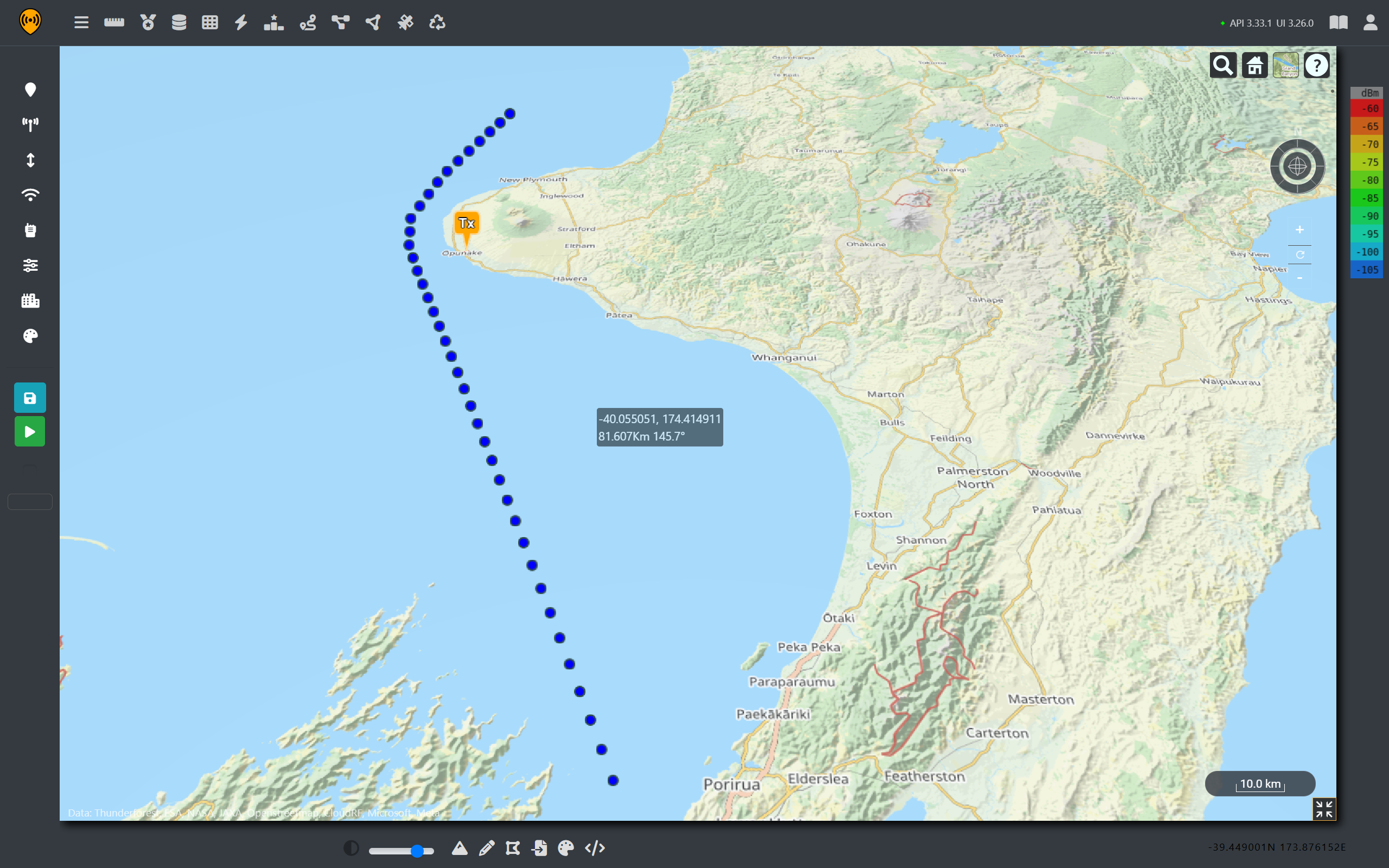
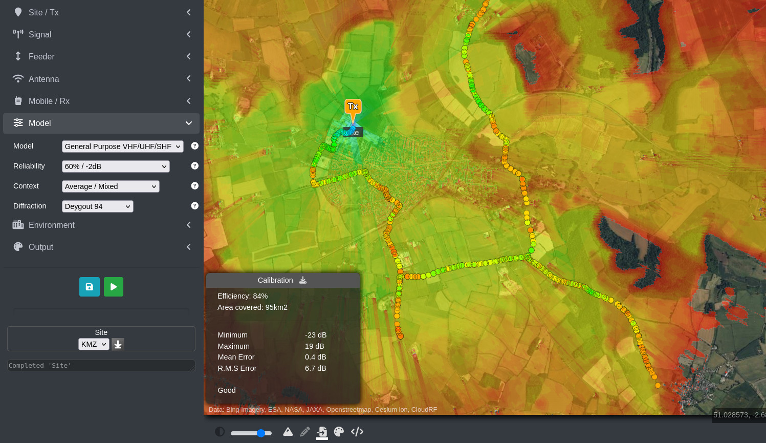
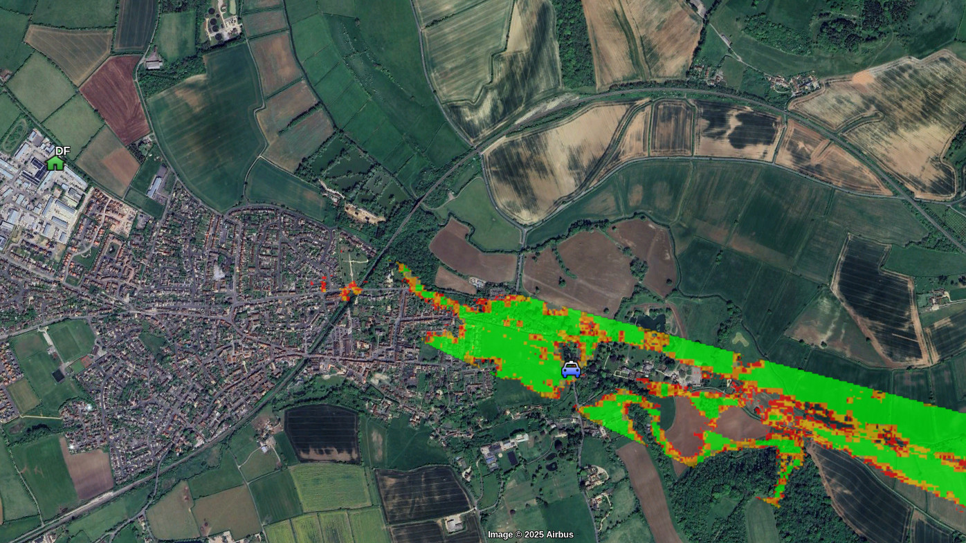
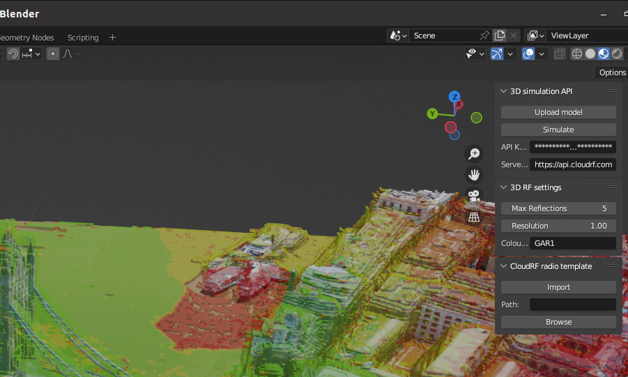
Using automatic processing, we can use the radar template to efficiently model coverage for each point and then use Superlayer to combine these results into a single layer.
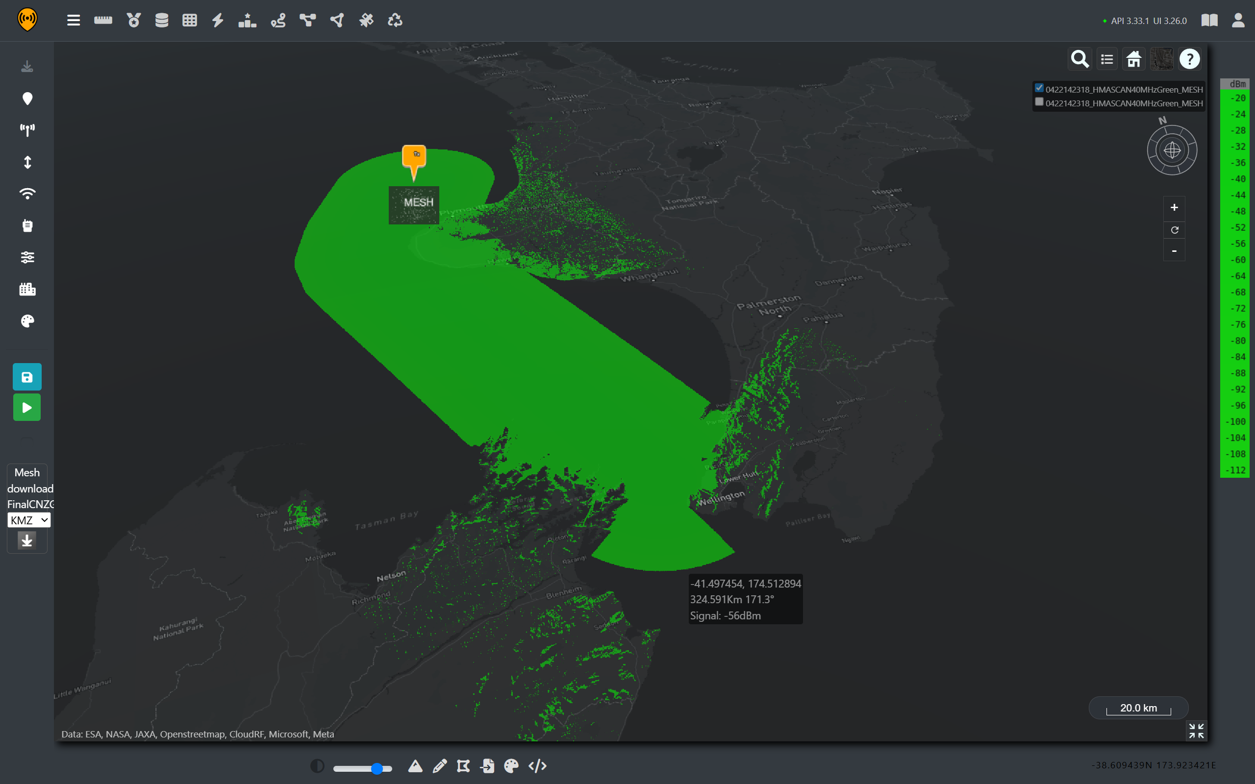
Using our templated radar, we can see that the entire coastline on the West Coast is a above the power threshold that would trigger DFS. We can also see that northern coastal and mountainous areas of the South Island. This aligns with the reported outages and also shows affected areas which may not have made the news.
On the west coast, we can see that the gentle slope up from the coast towards Mt Taranaki offers little obstruction to the radar signal.
From the coverage maps it is safe to conclude that the outage was caused by the DFS triggers rather than physical interference on the antennas. It was an inconvenience for the affected businesses and customers but an effective demonstration of spectrum co-existence technology working as intended.
For many readers of the subsequent news articles, it was the first time they had learnt that a ship can disable internet access, and it’s a standard baked into radio equipment.
What if there wasn’t DFS?
When viewing these images, it might be tempting to ask the question, “Why does this radar system need protecting? And what would happen to the FWA network if DFS wasn’t required?
To do that, it is necessary need to investigate both emitters to see how the two networks could interfere with each other.
Radar Signal Interference on the WISP.
To establish the interference of one network upon another is a straight forward task with the interference tool. However, before we can jump straight into the analysis, we need to make sure we are comparing apples to apples.
To begin with, radar signals are typically circular polarised. However, our FWA is vertically polarised so we will have some polarisation loss which will be estimated at -3dB.
Additionally, the centre frequency our radar system and bandwidth is not always the same as our radio channels, we will need to compare across the range of channels to see how the radar system affects adjacent channels rather than just co-channel interference.
Referring back to the RSMNZ chart, we can see that many channels are varying bandwidths. For this analysis, we will focus on the 40MHz 802.11 channels.
| 802.11 Channel Number | Centre Frequency (MHz) |
|---|---|
| 102 | 5510 |
| 110 | 5550 |
| 118 | 5590 |
| 126 | 5630 |
| 134 | 5670 |
| 142 | 5710 |
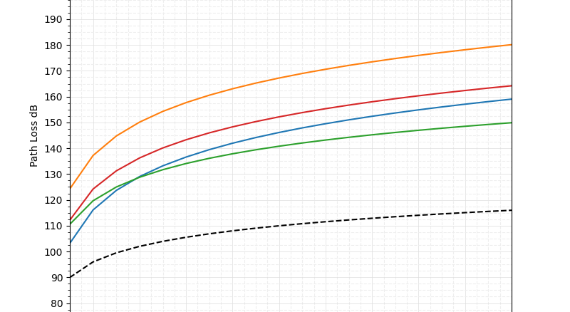
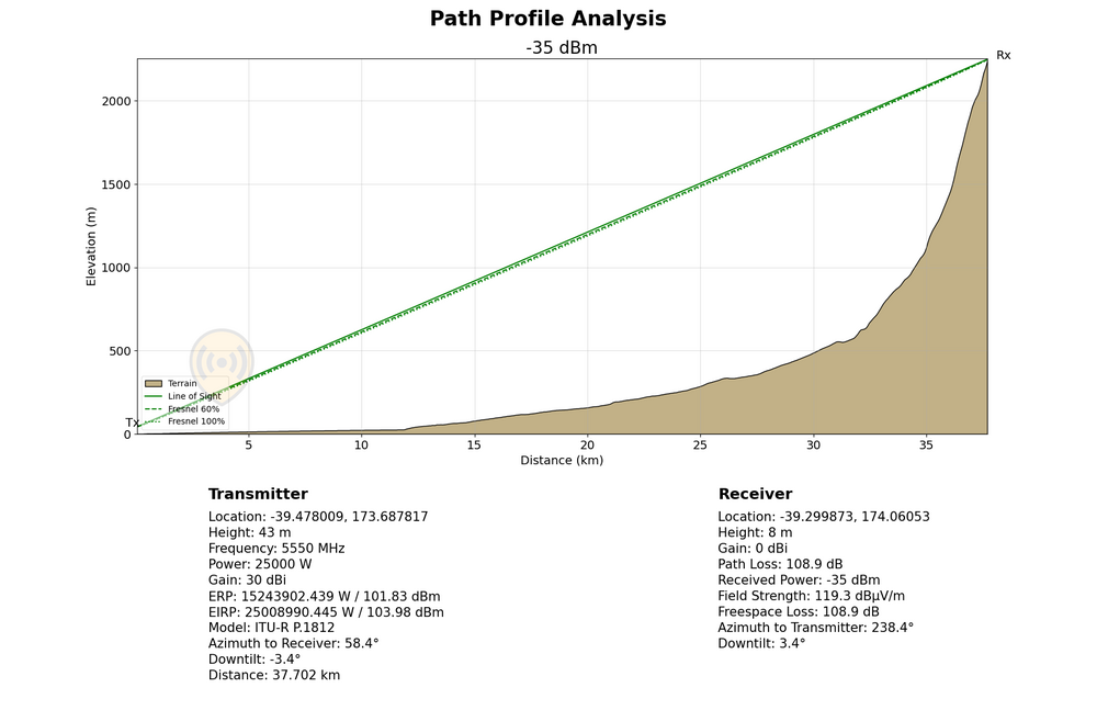
Using our FWA templates, we can quickly produce coverage maps and then use the interference tool in Cloud RF to see how the ship’s radar will impact connectivity on these channels of interest. Recalling that we are using a 40MHz radar signal centred at 5550MHz, we would expect to see interference within the range of 5530-5570MHz. This would overlap with channels 102 and 100, leaving the rest of the spectrum clear.
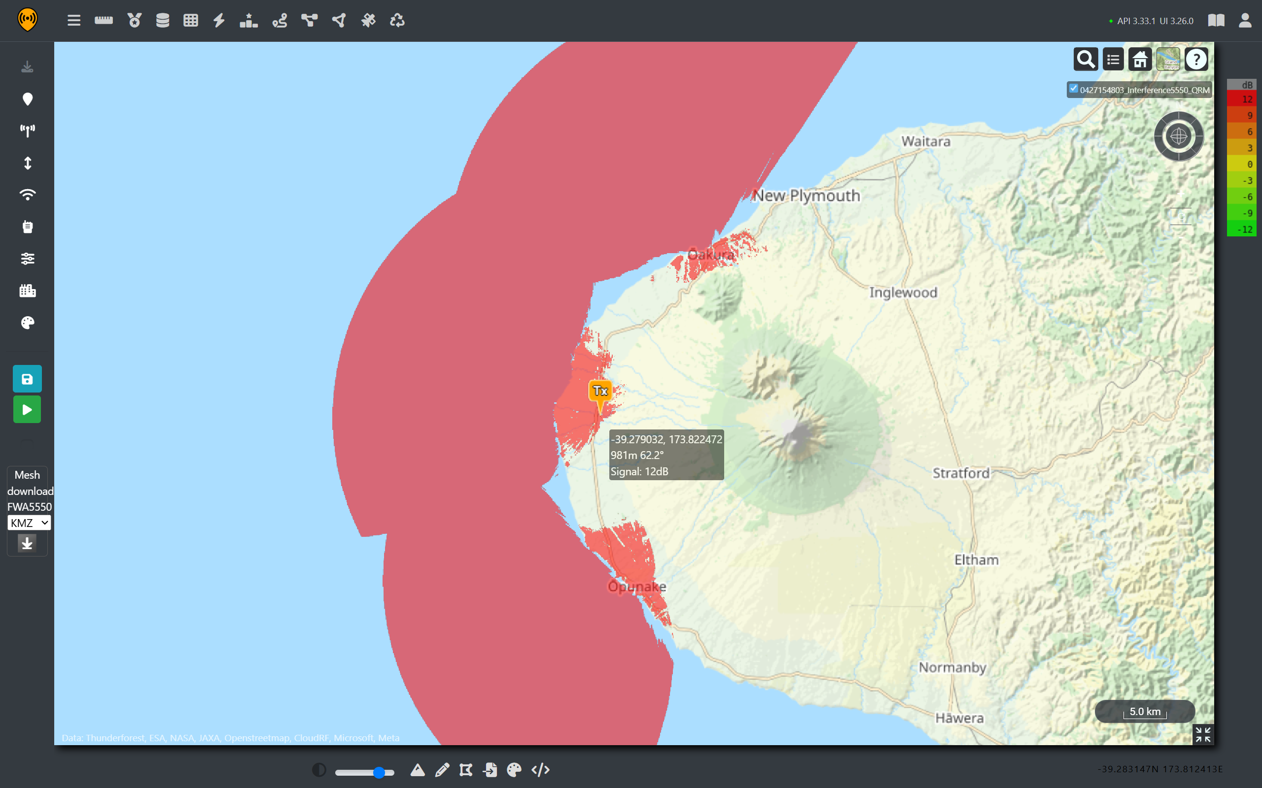
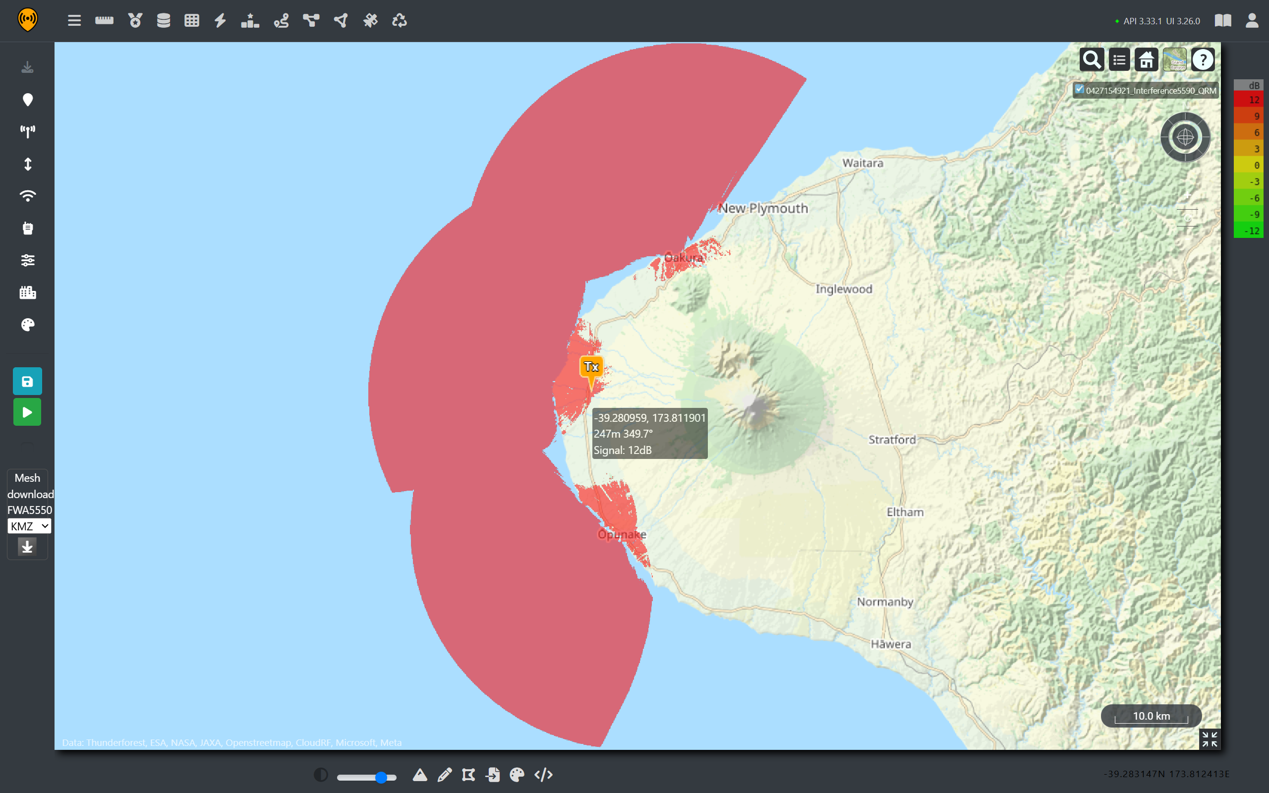
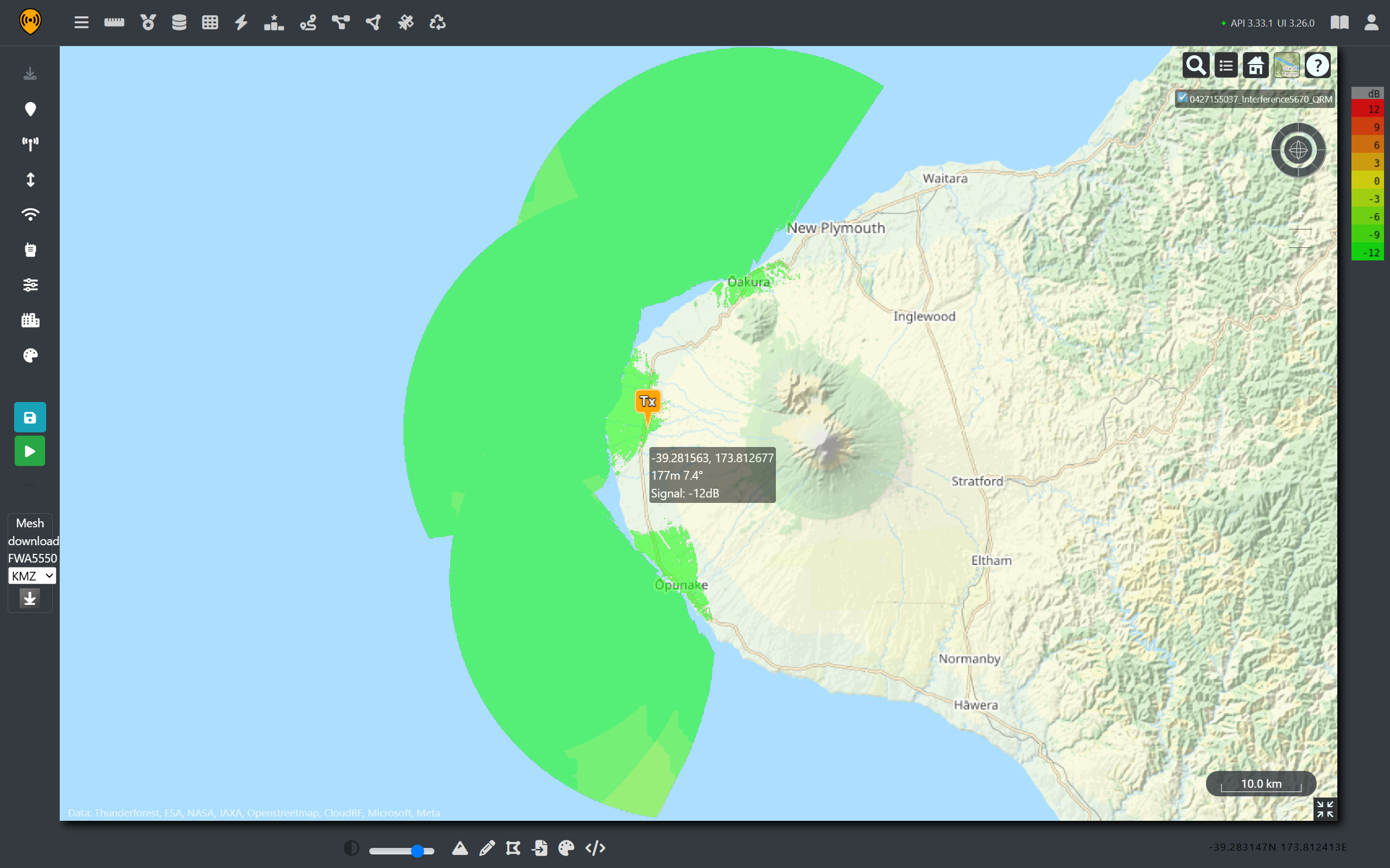
By using the interference tool, we can see that the simplistic assumption was only half-right and the relative strength of the radar signal has caused interference outside of it’s 40MHz bandwidth. Adjacent channel interference can still be observed up to 5630MHz before it drops away leaving channels 134 and 142 clear.
Signal power is shaped like a bell and is wider in practice than on paper.

As the radar bandwidth was assumed to be 40MHz, there is a possibility the actual SEA Giraffe could have used a wider bandwidth which would have caused wider adjacent channel interference, leaving none of the 40MHz 802.11 viable. So given the high levels of adjacent channel interreference we can safely say that without DFS, these WISPs would still be dealing with a significant outage until the ship had passed.
WISP Interference on the Radar Screen.
If the radar is so powerful, why is priority given to it compared with low power home networking equipment?
For that reason, it is worth looking at the effect of interference on a radar return. First and foremost, we need to understand the purpose of the radar is to aid navigation. Radio navigation is critical for detecting hazards when visibility is poor. For a military ship, particularly a helicopter carrier, surveillance and coordination of close airspace is also a key task.
Measuring interference is not easy as the exact relationship between the wireless transmission and the radar receiver is complex however we can model some educated assumptions to show the potential effect.
First, not all the power from the coastal signal will be absorbed by the radar antenna due to polarisation and what is makes it to the radar screen will be further attenuated by the receiver’s processing gain as the radar will use spreading codes, beamforming and other techniques to improve selectivity and mitigate interference. To model them, we’d need very detailed information on the Sea Giraffe which is not publicly available.
What we can observe, however, is the rise of the noise floor due to the addition of WISP transmissions around the ship and this will impact the signal-to-noise ratio (SNR) before signal processing.
First, we will use a FWA channel that is entirely within the bandwidth of the radar signal to keep spectral density simple. For this case we will use channel 110 at 5550MHz.
The noise floor is given by the combination of the radar’s thermal noise, the power of the FWA signal and other sources. Noise is computed using the signal power divided by Boltzmann’s constant.
As the radar noise floor is relatively constant, by using Cloud RF, we can generate received power predictions and then use the noise database feature to visualise the effect of a changing noise floor on radar return coverage.
We will use another fictional FWA site that is pointing out along the coast, providing coverage to a coastal town. From this tower, the signal propagates beyond it’s intended audience and is received by the ship’s antenna.
To address the change from vertical to circular polarisation, we can factor in a -3dB loss.
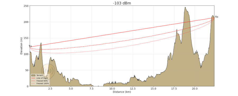
At our reference points, we can see that the ship travels through the FWA coverage, which peaks at around -76dBm despite being over 16km away from the receiver. This is because our radar antenna is elevated and it has a high 30dBi gain. As both systems are working on channel 110, all of this received power is in band for the radar and adds to the noise floor.
With a value for WISPs sorted, we can calculate the Radar Thermal Noise Floor at 40 MHz.
N = kTB = 1.38×10⁻²³ × 290 × 40×10⁶ = -108 dBm
And then converting to mW we can see that our new noise value is dominated by our WISP signal due to the orders of magnitude in difference.
| Noise Sources | Power (mW) |
|---|---|
| Thermal noise (-108 dBm) | 1.585 × 10⁻¹¹ |
| WISP in band (-76 dBm) | 2.512 × 10⁻⁸ |
| Combined | ≈ 2.512 × 10⁻⁸ (-76dBm) |
For a simple SNR equation, this much noise will lead to a drastic reduction in detection range. In reality, the Sea Giraffe will have front end filtering and signal processing techniques built in to significantly boost it’s signal ratio and maintain a clear picture. It is also important to note that this interference will only be coming from one angle, which makes it’s effect asymmetric.
From the different coverage plots, we can see that varying noise sources change coverage significantly and as RADAR is a directional array, a blind spot can be directional.
We can see that there is potential that increased noise in the C band could lead to a notable reduction in radar picture accuracy which presents a danger to maritime navigation, which has priority.
From the analysis, it is clear that the DFS system functioned as intended. It kept the ship’s navigation systems safe from interference at the cost of a temporary disruption for the coastal communities.
To prevent this happening, visiting warships could be given spectrum assignments clear of civilian infrastructure, or could signal their intentions in advance to local spectrum authorities. Vigilant spectrum surveillance could also provide early warning of anomalies which could be communicated to local spectrum users.
Coastal interference demo
Because we’ve leveraged the Cloud RF API and made templates, we can package our multi-step static analysis into a dynamic and simple tool. Using everybody’s new team member, Claude, we have published a simple tool which can demonstrate the signal strength for a ship’s radar as received by a coastal network.
Explore the tool here: https://cloud-rf.github.io/CloudRF-API-clients/slippy-maps/radar_interference_demo.html
References
HMAS Canberra https://www.dvidshub.net/image/6755556/us-special-operations-australian-navy-accomplish-combined-black-hawk-deck-landings
HMAS Canberra Capabilities, https://www.navy.gov.au/capabilities/ships-boats-and-submarines/hmas-canberra-iii
SAAB Sea Giraffe AMB, https://www.radartutorial.eu/19.kartei/07.naval/karte038.de.html
HMAS Canberra accidentally blocks wireless internet and radio services in New Zealand | RNZ News